You’ve scrolled through Pinterest boards. You’ve saved dozens of Instagram posts. You’ve torn pages from magazines and taped paint chips to your walls. And yet, choosing the right blue for your home still feels like a guessing game.

If you’re searching for interior painting Harrisburg NC solutions because your rooms need new life, you’re facing a real problem. Blue sounds simple until you realize there are hundreds of variations—and picking the wrong one means living with a color that feels off every single day.

Here’s what makes this frustrating: that perfect blue you spotted online probably looked amazing because of the lighting, the furniture, and the photography. Your home has different windows, different floors, and different light. The best blue paint colors for interiors aren’t universal. They depend on your specific space.

So let’s skip the guesswork. These five blues have earned their reputation in real North Carolina homes, and understanding what makes each one work will help you choose with confidence.

Key Takeaways

  • Bold navy shades like Naval and Salty Dog create anchor points that ground a room and add instant character.

  • Transitional blues like Smoky Blue contain undertones that shift with changing light throughout the day.

  • Lighter blues like Stardew and Silvermist open up spaces and create peaceful, welcoming atmospheres.

  • North Carolina’s seasonal light variations affect how blue reads on your walls from summer to winter.

  • How paint is applied matters as much as color choice. An experienced interior painter delivers results that last.

Blue and North Carolina Homes: A Natural Match

Harrisburg sits in a region where four distinct seasons bring changing light conditions throughout the year. Summer delivers bright, warm sunshine. Winter brings softer, cooler tones through your windows. Spring and fall offer something in between.

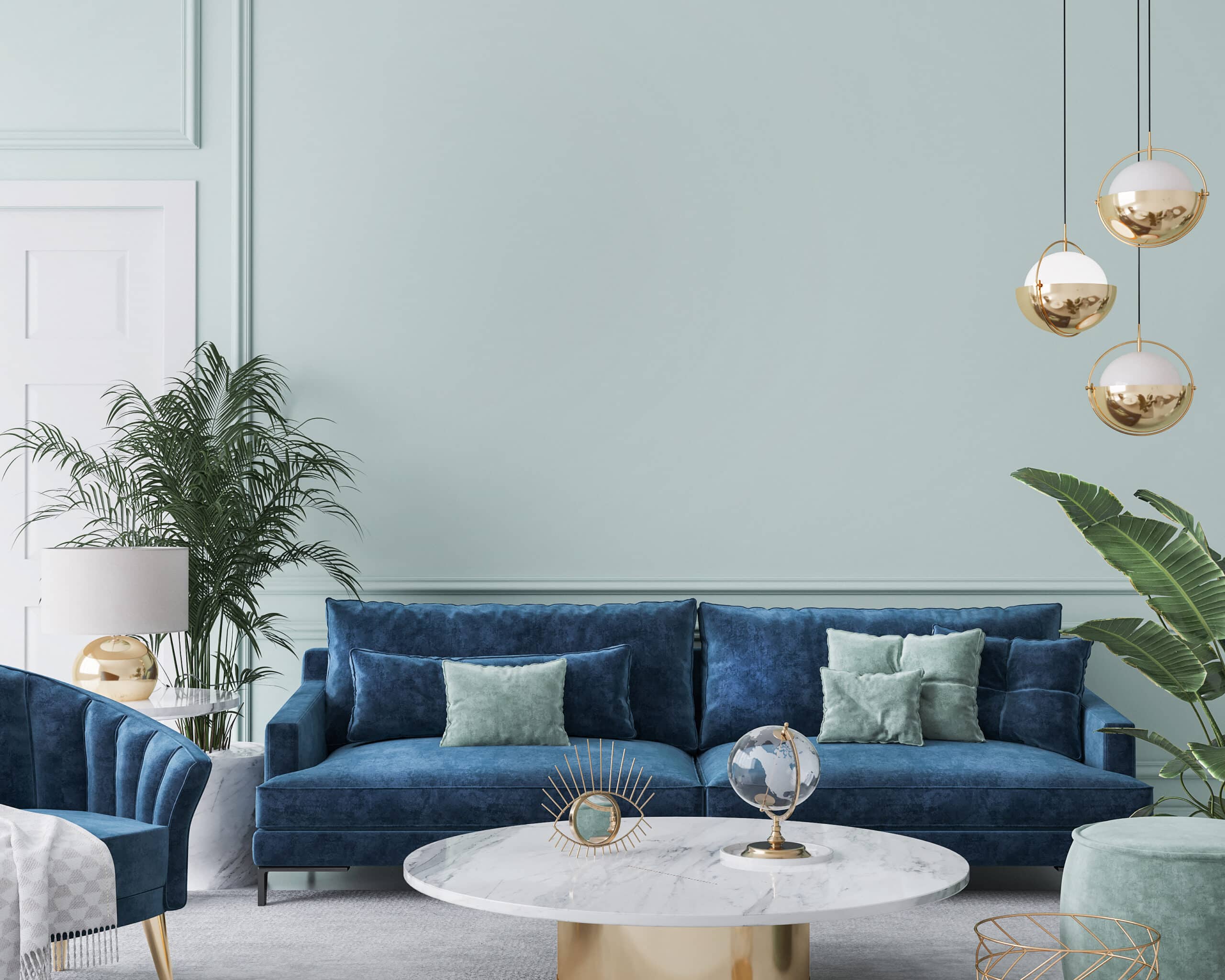
This variation matters when selecting the best blue paint colors for interiors. A shade that feels cozy in January might seem heavy in July. A color that sparkles in afternoon light could fall flat on overcast mornings.

Blue handles these shifts better than most colors. Its natural versatility means it adapts to seasonal changes without looking wrong. The key is matching the right blue to your room’s orientation and your personal tolerance for color intensity.

5 Best Blue Paint Colors for Interiors

  • Rooms Where Naval Thrives

    Dining rooms benefit from Naval’s formality. The color creates an intimate setting that feels special for gatherings. Home offices gain authority. This isn’t a color for casual spaces. Accent walls in living rooms or bedrooms add drama without overwhelming the entire room.

  • What to Consider

    Naval drinks light. A professional house painter will tell you this shade needs balance—adequate natural light, lighter furnishings, or strategic lamp placement. Small rooms with few windows may feel compressed rather than cozy. Testing a large sample on your actual wall, not just a tiny chip, prevents regret after the interior house painting project wraps up.

  • Where Salty Dog Shines

    Kitchen cabinetry, especially lower cabinets paired with white uppers, looks stunning in Salty Dog. The color adds personality without making cooking spaces feel dark. Bedroom walls gain depth that feels restful rather than stimulating. Bathroom vanities become focal points instead of afterthoughts.

  • The Classic Combination

    Pair Salty Dog with bright white trim and you get that timeless look that never dates. It’s the same combination you see in historic homes, coastal cottages, and modern farmhouses. The formula works because it balances boldness with brightness.

  • Best Applications for Smoky Blue

    Rooms with abundant natural light show this color’s full range. Large windows facing multiple directions let you experience Smoky Blue’s shifts throughout the day. Transitional-style homes, those blending traditional architecture with contemporary furnishings, find a natural partner in this adaptable shade.

  • A Word of Caution

    An interior painter experienced with this color will recommend living with samples for several days before committing. Paint a large test patch and observe it at 7 AM, noon, and 9 PM. If the variation bothers you during sampling, it will definitely bother you after full application.

  • Ideal Spaces for Stardew

    Primary bedrooms become retreats rather than just places to sleep. Home offices feel focused without feeling sterile. Bathrooms take on spa-like qualities. Nurseries gain softness that grows with children rather than feeling juvenile.

  • The Prep Factor

    Light colors reveal every wall imperfection—bumps, patches, texture inconsistencies, old nail holes. Proper surface preparation becomes non-negotiable with shades like Stardew. A professional house painter spends significant time on prep work for light colors because the final result depends on it. Cutting corners here means your beautiful soft blue showcases every flaw.

  • Where Silvermist Excels

    Living rooms with eclectic furnishings find harmony under Silvermist’s unifying presence. Kitchens with mixed metal hardware (brass pendants, chrome faucets, black cabinet pulls) suddenly look intentional rather than mismatched. Hallways connecting rooms with different color schemes transition smoothly in Silvermist.

  • Why an Interior painter Often Suggests It

    Silvermist forgives indecision. Homeowners paralyzed by too many options often find relief in this shade because it works with almost everything. If you’re not sure what you want but know you want something better than what you have, Silvermist offers a safe yet sophisticated path forward.

How Harrisburg’s Light Affects Your Blue Choice

Unlike regions with consistent overcast skies or constant sunshine, North Carolina delivers variety. That variety shows up in your paint.

South-facing rooms receive the most intense light and warmth. Blues here can handle more depth—even Naval won’t feel oppressive when abundant sunshine balances it. Lighter blues like Stardew may wash out in peak afternoon brightness, losing their subtle color.

North-facing rooms get softer, cooler, more consistent light. Blues with gray undertones lean grayer here. If you want clearly blue walls in north-facing spaces, choose shades with less gray influence—Salty Dog over Smoky Blue, for example.

Rooms with multiple window orientations experience the full range. Your paint will shift throughout the day. This can be beautiful with the right shade or frustrating with the wrong one. Sampling becomes especially important in these spaces.

Why Application Quality Changes Everything

Even the best blue paint colors for interiors fall flat when applied poorly. Here’s what separates professional interior house painting results from amateur attempts:

  • Surface Preparation Determines the Final Look

    Walls accumulate damage, stains, and texture issues over years. Proper prep means filling, sanding, priming, and smoothing before any color touches the wall. Skipping steps means your paint highlights problems rather than hiding them.

  • Primer Choice Affects Color Accuracy

    A professional house painter selects primer based on what’s needed—tinted primer for deep colors, stain-blocking primer for problem walls, adhesion primer for slick surfaces. Wrong primer means more coats, longer timelines, and potentially different color results than expected.

  • Application Technique Creates the Finish.

    Roller pressure, brush angle, spray pattern, and drying time between coats all affect texture and sheen consistency. Lap marks, roller lines, and uneven coverage happen when technique falters.

  • Cut-in Precision Makes or Breaks the Job

    Clean lines where walls meet ceilings and trim require steady hands and proper tools. Wobbly edges announce amateur work regardless of how beautiful the color looks.

Walls Worth Coming Home To

The best blue paint colors for interiors aren’t about trends or what looks good in someone else’s house. They’re about what works in your rooms, with your light, for your life.

If you’re a Harrisburg homeowner tired of staring at walls that don’t make you happy, Ukie Painting is ready to help. From color selection guidance to flawless application, our team handles every step so your only job is enjoying the results.

Call 980-447-6311 today for a free estimate. No pushy sales tactics. No pressure to decide on the spot. Just straightforward answers and honest advice from people who want your walls to look exactly how you’ve been imagining them.